Categorizing Numeric Data
Displayr allows you to categorize your numeric data. Your survey may have asked a question such as "How many years has your business been operating?" or "How old are you?" - and asked the respondent to move a slider or enter a number as their answer. Displayr will normally infer that this data is Numeric, however if the data is Text, you will first need to convert it to Numeric using Data Manipulation > Structure > Average. Categorizing is the act of allocating the numbers into categories as numeric ranges.
This is also known as:
- The act of bucketing, where buckets are the categories.
- The act of bracketing, where brackets are the categories.
The benefits of categorizing are:
- Allows you to avoid creating categories up front in your survey question, for when you do not yet understand your market.
- Dynamically create and adjust categories/buckets that suite the distribution of your responses (i.e. if you get a lot of young people answering your survey, you can specify lots of young age categories).
- View percentages instead of an average.
- Break down other questions in your survey by the categories.
In Displayr, categorizing is performed with a tool that accompanies Histogram charts. It is a visual way of categorizing. Here is a tutorial:
- Log in to Displayr and select + Add New to start a new docuemnt.
- Select Home > Data Sets > New Data Set.
- Select My Computer and upload the bus phone survey.sav data set.
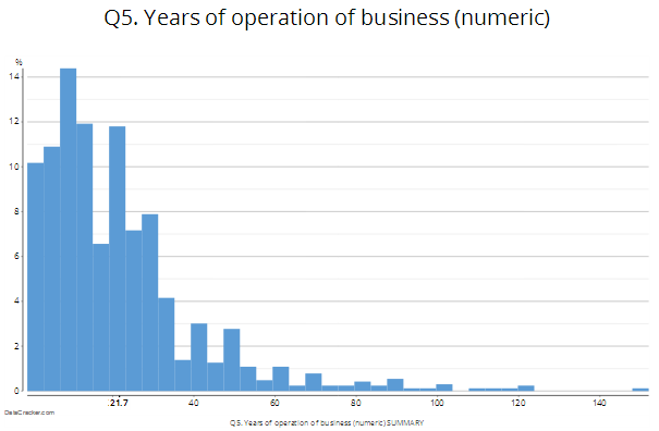
- Drag Years of operation of business (numeric) from Data Sets onto the page.
- Select Home > Chart > Histogram to convert your table into a historgram.
- Click the Histogram ribbon tab.

- Click the Categories button.
- This is the tool which will allow you to allocate the numeric data into categories (“buckets” mean the same thing, but the standard terminology is categories).
- Observe that the options are:
- Do not generate categories – currently selected
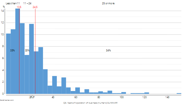
- Generate categories with equal proportions – this is a starting point, where the data is categorized into 3 categories with equal proportions (e.g. 33%, or as close as it can be, according to the data)
- Generate categories with equal intervals – this is an alternative starting point, where the 3 categories are equally spaced between the minimum and maximum.
- Choose Generate categories with equal proportions.
- You may customise the categories. For example:
- Change the number of categories to 5 by clicking the Categories button again, and changing Number of categories from 3 to 4. A new red line is added on top of the histogram.
- Change the category cutoff points. For example, click on one the first red line so it appears selected. Once it appears selected (a new grey rectangle appears around it), click and drag the line to the left or right to change its cutoff point. Once you let go of your mouse, you can observe that the category labels and percentages update automatically. (Tip: when the red lines are overlapping the blue bins, they can be difficult to select. Try selecting near the red value at the top of the line, or zooming in first.)
- You may now use the new categorized data in other charts or tables:
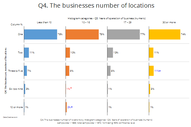
- Drag Q4. The businesses number of locations from under Data Sets onto the page.
- Change it to a chart using Home > Chart and clicking the bar chart.
- In Inputs > DATA > Columns, select the new data Histogram categories - Q5. Years of operation of business (numeric). (Tip: This new data will be at the bottom of the list, not the top!)
- Observe that the chart now shows the data by your categories.

- You can change the labels by selecting the variable Histogram categories - Q5. Years of operation of business (numeric) under Data Sets and then clicking the Labels button in the DATA VALUES section of Object Inspector and entering new labels.
Now that you have made category data, there are two important points to note about Displayr in general that will make you work better:
- Displayr is dynamic: if you further customize your categories in the histogram (e.g. changing the cutoff points or category labels), that will automatically flow through to any chart that shows this categorized data.
- If you make a mistake when categorizing, you can use the Undo button at any time.
